

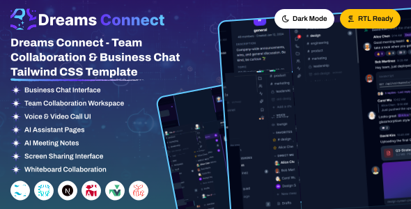
Dreams Connect is a modern, responsive social networking dashboard template built with Angular and Tailwind CSS, designed to create engaging online communities. It includes beautifully crafted pages, feeds, messaging, groups, events, notifications, and community management. Dreams Connect helps you build scalable social networking, community, and collaboration platforms with ease.
Dreams Connect offers 3 powerful dashboard variations and 10+ fully functional, prebuilt application modules with a clean, modular structure.
Prebuilt Applications
- User Profiles & Social Feeds
- Real-Time Chat & Group Conversations
- Communities, Groups & Events
- Friend Requests, Notifications & Activity Feed
- Media Sharing, User Management
Layout & Mode Features
- Full responsive design (Mobile, Tablet, Desktop)
- Built-in Light / Dark Mode Toggle
- Full RTL Layout Direction Support
- Layout Direction Variations
Project Overview
The project follows a modular structure with clear separation of concerns.
angular/
├── public/                		 		# Static assets (favicon, images, etc.)
├── src/
│   ├── assets/            		 		# Images, icons, styles (css/)
│   ├── app/
│ 	│	├── core/          		 	# models,routes,services
│   │   └── features/ 	   		 		# Main pages Directory
│	│   │   ├── auth/  			 	# Authentication pages
│	│   │   ├── Pages/           			# Pages Modules,routes
│   │	├── layouts/			 		# Common header , footer components
│   │	├── shared/				 	# Shared Components
│   │   ├── app.config.ts/
│   │   ├── app.html/
│   │   ├── app.routes.ts/
│   │   ├── app.css/
│   │   └── app.ts/
├── editorconfig
├── gitignore
├── angular.json
├── package.json
├── tailwind.config.js
├── README.md
├── tsconfig.app.json
├── tsconfig.json
└── tsconfig.spec.json
Node.js and NPM :
If NodeJS is not installed then download it from https://nodejs.org/. NPM comes bundled with Node.js. Recommended version: Node.js 24.0.0Angular-cli :
You can install angular-cli by executing from your command windownpm install -g @angular/cli. More details can be found here https://github.com/angular/angular-cli
If you have Angular CLI installed previously, update it to the latest Angular CLI. Remove the older version and re-install it.
npm uninstall --global @angular/clinpm install --global @angular/cli@22NPM Packages
- Before proceding you'll need to install npm packages. You can do this by running
npm installfrom the root of your project to install all the necessary dependencies.
npm install
Development Server
- Run
ng servefor a dev server. Navigate to localhost:4200/. The app will autometically reload if you change any of the source files.
ng serveBuild Project
- Run
ng buildto build the project. The build artifacts will be stored in thedist/directory. Use the--prodflag for a production build.
npm install -D tailwindcssnpx tailwindcss init -pEdit 'tailwind.config.js' and update the content paths as follows:
 /** @type {import('tailwindcss').Config} */
module.exports = {
  content: [
    "./src/**/*.{html,ts}"
  ],
  theme: {
    extend: {},
  },
  plugins: [
    require('@tailwindcss/forms'),
  ],
}
Install the Preline package to add interactive UI components and utilities for Tailwind CSS in the project.
npm i prelineUpdate the tailwind.config.ts
/** @type {import('tailwindcss').Config} */
module.exports = {
  content: [
    "./src/**/*.{html,ts}",
    "./node_modules/preline/dist/*.js" --> Add this
  ],
  theme: {
    extend: {},
  },
  plugins: [
    require('@tailwindcss/forms'),
  ],
}
Build
Run the build command to generate the production-ready output in the dist/ directory:
ng buildDeployment
Deploy the dist/ folder contents to your web server. The build output contains all compiled files.
The default typography font for the template is Geist. If you want to change it to another Google font (like Inter or Roboto):
Open the style file src/assets/css/style.css and update the @import statement at the top of the file as well as the primary font variable in the @theme configuration block:
/* 1. Import the new Google Font from the assets at the very top of style.css */
 link href="https://fonts.googleapis.com/css2?family=Inter:wght@300;400;500;600;700&display=swap" rel="stylesheet">

/* 2. Update the variable inside the @theme block */
--font-sans: "Inter", system-ui, -apple-system, sans-serif;
All theme colors are defined as design tokens under the @theme directive in your src/assets/css/style.css file. These variables control the look and feel of components:
:root {
       --gold: #D4AF37;
        --gold-light: #F4D03F;
        --gold-dark: #B8860B;
        --gold-soft: #C9A227;
        --gold-rgb: 212,175,55;
        --gold-light-rgb: 244,208,63;
        --gold-dark-rgb: 184,134,11;
}
Changing Element Colors
You can customize the color of any element by editing its class or variable assignment in the CSS file. For example, changing the header topbar background color:
.app-header {
    @apply background: var(--surface);
}How it Works
Theme switching works by adding or toggling the class="dark" attribute on the root <html> element. The template automatically stores the user's theme selection in their session storage.
1. Attribute Control
To enable dark mode, set the attribute on the root tag:
<html lang="en" class="dark">2. Tailwind CSS v4 Integration
In style.css, dark mode uses a custom variant that links the Tailwind dark: modifiers directly to the HTML attribute:
@custom-variant dark (&:where([class="dark"], [class="dark"] *));You can write responsive layouts by simply adding prefix variants to any tag like dark:bg-dark-900 or dark:text-white.
3. Persisted Theme Javascript
The file src/assets/js/theme-script.js runs at page start to prevent screen flashing. It checks the user's session configuration:
// Loads stored choice on page load
const savedConfig = JSON.parse(sessionStorage.getItem("__THEME_CONFIG__")) || {};
const theme = savedConfig.theme || "mode-light";
document.documentElement.setAttribute("class", theme);To enable Right-to-Left (RTL) layout, add the dir="rtl" attribute to the <html> tag:
<html lang="ar" dir="rtl"> class="lay-rtl"Tailwind CSS handles RTL layout transformations automatically when the dir attribute is set. All margin, padding, and positioning utilities adapt to the RTL direction.
RTL Demo
An RTL demo page is available at layout-rtl in the HTML version for reference.
The default layout features a full vertical sidebar on the left, a horizontal topbar at the top, and the main content area. This is the standard layout used across all dashboard pages.
- Full-width sidebar with navigation menu, logo, and user profile
- Top header with search, notifications, and user actions
- Responsive - sidebar collapses to overlay on mobile devices
The mini sidebar layout collapses the sidebar to show only icons, providing more space for the main content area. Users can toggle between expanded and collapsed states using the sidebar toggle button.
- Collapsed sidebar showing only menu icons
- Hover to expand and reveal full menu text
- Toggle via the hamburger button in the topbar
Dreams Connect is developed by Dreams Technologies and is available under both Envato Extended & Regular License options.
Regular License
Usage by either yourself or a single client is permitted for a single end product, provided that end users are not subject to any charges.
Extended License
For use by you or one client in a single end product for which end users may be charged.
What are the main differences between the Regular License and the Extended License?
If you operate as a freelancer or agency, you have the option to acquire the Extended License, which permits you to utilize the item across multiple projects on behalf of your clients.
If you have any questions or run into issues with the template, feel free to contact us via email at support@dreamstechnologies.com.
Response Time: Typically 12–24 hours on weekdays (GMT+5:30). Support covers template bugs, errors, and standard features. It does not cover custom installations or custom coding changes.
Contact SupportDo you need custom development for your application?
If you need customization, new page integration, feature setups, or database connections, our engineering team can help tailor this template to your precise specifications.
- Tailoring features to your exact branding and workflow.
- Deploying the template to your production servers.
- Integrating backend endpoints and databases.

Thank You
Thank you for choosing **Dreams Connect**! We hope this template facilitates building your application. We kindly ask you to share your feedback by leaving a rating on ThemeForest.
Leave a Review