

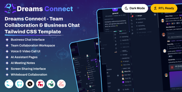
Dreams Connect React is a modern, responsive team chat and collaboration workspace built with React 19, TypeScript, Vite, and Tailwind CSS v4. It includes beautifully crafted pages for messaging, threads, calls, files, and a full AI suite, helping you build scalable chat, community, and collaboration platforms with ease.
Dreams Connect React delivers a complete team chat workspace with prebuilt, fully functional page modules and a clean, modular component structure.
Prebuilt Applications
- Channels, Direct Messages & Threads
- Voice & Video Calls with Call History
- AI Suite – Assistant, Rewrite, Summary, Translate
- Files, Bookmarks, Media Gallery & Activity Feed
- Team Directory, Profile, Billing & Invites
Technical Features
- React 19.2.7 + TypeScript with React Compiler
- Vite 8 build tooling & React Router v7 lazy routes
- Tailwind CSS v4 CSS-first configuration
- Built-in Light / Dark Mode & 6 Accent Colors
- Full RTL Support & Responsive Design
Project Overview
The project follows a modular structure with clear separation of concerns.
react/
├── public/
│   ├── apple-icon.png
│   └── favicon.png
├── src/
│   ├── assets/img/          # logo.svg, logo.png, favicon.png, profiles/
│   ├── components/          # ai, calls, chat, layout, settings, skeleton, ui
│   ├── contexts/            # Theme, Settings, Toast, Notifications, AiPreferences
│   ├── core/data/           # interface.ts, imagedata.ts - shared TS types & assets
│   ├── hooks/               # useModal, useDropdown, useDisclosure, useCallTimer, ...
│   ├── layout/              # AppShellLayout, AuthLayout, SettingsLayout
│   ├── routes/              # all_routes, router, router.link, lazyRoute, dynamicTitle
│   ├── utils/               # shared helpers
│   ├── views/               # page modules (chat, ai, account, auth, misc)
│   ├── App.tsx              # provider tree + router mount
│   ├── environment.tsx
│   ├── index.css            # theme tokens + Tailwind entry
│   └── main.tsx             # React root
├── eslint.config.js
├── index.html
├── package.json
├── postcss.config.js
├── tsconfig.json
└── vite.config.ts
Shared Components (src/components/)
ui: Accordion, Button, ContextMenu, Dropdown, EmojiPicker, GifPicker, Input, Lightbox, Modal, RadioCard, Select, Tabs, Toggle, Tooltip — layout: WorkspaceRail, ChannelSidebar, LegalDocLayout, AuthDivider, AuthMobileLogo, SocialAuthButtons, DemoBar — plus ai, calls, chat, settings, skeleton and image-with-base-path.
Page Modules (src/views/)
chat: Home, Threads, Dm, Calls, Files, Bookmarks, ActivityFeed, Notifications, TeamDirectory, Status — ai: AiAssistant, AiRewrite, AiSettings, AiSuggestions, AiSummary, AiTranslate — account: Profile, Settings, Billing, Invite, MediaGallery — auth: Login, Register, ForgotPassword, ResetPassword, VerifyEmail — misc: Welcome, Shortcuts, LockScreen, Maintenance, Error404, PrivacyPolicy, TermsOfService
Structure Overview
Dreams Connect React uses React Router v7, lazy-loaded pages, React Context providers, and shared layouts to keep the app scalable and maintainable.
The React root in src/main.tsx mounts App.tsx, which composes the provider tree and the router.
Below is the React app entry:
import { BrowserRouter } from "react-router-dom";
import { PrimeReactProvider } from "@primereact/core/config";
import { ThemeProvider } from "./contexts/ThemeContext";
import { SettingsProvider } from "./contexts/SettingsContext";
import { ToastProvider } from "./contexts/ToastContext";
import { NotificationsProvider } from "./contexts/NotificationsContext";
import { AiPreferencesProvider } from "./contexts/AiPreferencesContext";
import ALLRoutes from "./routes/router";
import DynamicTitle from "./routes/dynamicTitle";

function App() {
  return (
    <PrimeReactProvider>
      <ThemeProvider>
        <SettingsProvider>
          <ToastProvider>
            <AiPreferencesProvider>
              <BrowserRouter basename={import.meta.env.BASE_URL}>
                <NotificationsProvider>
                  <DynamicTitle />
                  <ALLRoutes />
                </NotificationsProvider>
              </BrowserRouter>
            </AiPreferencesProvider>
          </ToastProvider>
        </SettingsProvider>
      </ThemeProvider>
    </PrimeReactProvider>
  );
}

export default App;
State Management
State is handled with React Context providers in src/contexts/ – no external store library is required:
ThemeContext– dark/light mode, layout direction and accent color, persisted tolocalStorage.SettingsContext– workspace and user preference settings.ToastContext– global toast notifications.NotificationsContext– in-app notification state.AiPreferencesContext– preferences for the AI suite pages.
Routing
Routing is handled by react-router-dom v7. The basename comes from Vite's import.meta.env.BASE_URL, which resolves to /react/.
src/routes/all_routes.tsx– central map of path constants used across the app.src/routes/router.link.tsx– exportsappRoutes,settingsRoutes,authRoutesandstandaloneRoutes, each entry shaped{ path, element, meta_title }.src/routes/router.tsx– nestsappRoutesunderAppShellLayout,settingsRoutesunderSettingsLayoutandauthRoutesunderAuthLayout.standaloneRoutesrender bare, because they bring their own shell.src/routes/lazyRoute.tsx–React.lazy+Suspensewith a shape-matchedPageSkeletonfallback, keyed on the pathname so the skeleton renders on every navigation.src/routes/dynamicTitle.tsx– setsdocument.titlefrom each route'smeta_title.
The import() literal must stay inline at each call site in router.link.tsx. Extracting it into a variable breaks Vite's static analysis and therefore code-splitting.
Prerequisites
Node.js and NPM :
Ensure that Node.js is installed and running on your system.
https://nodejs.org/en/download/
Package Manager
Use npm (recommended with this project lockfile) or Yarn if preferred.
npm -vVite
Vite is used as the build tool. It is installed automatically as a project dependency – no global installation required.
https://vite.dev/
Installation Steps
Extract & Navigate
After downloading, extract the Dreams Connect package and navigate to the react directory.
Install Dependencies
npm installBefore proceeding you'll need to install npm packages. You can do this by running npm install from the root of your project to install all the necessary dependencies.
Start Development Server
npm run devFor running a project, run the command
Open in Browser
Open your browser at http://localhost:5173/react. Vite serves on its default port 5173, and the /react path comes from base: "/react" in vite.config.ts.
Build for Production
npm run buildThis runs tsc -b && vite build and outputs the production bundle to the dist/ directory. Use npm run preview to serve that build locally before deploying.
Because base is set to /react, the built app expects to be served under a /react path. Change base in vite.config.ts if you deploy at the domain root.
CSS-first configuration
This project uses Tailwind CSS v4, which is configured in CSS rather than JavaScript. There is no tailwind.config.js and no content array. Tailwind is wired in through the @tailwindcss/postcss plugin declared in postcss.config.js.
All configuration lives at the top of src/index.css:
/* 1. ALL @imports must be at the very top */
@import "tailwindcss";

/* 2. Then @layer and @custom-variant */
@layer base, components, utilities;
@custom-variant dark (&:where(.dark, .dark *));

/* 3. Then the theme tokens */
@theme {
    --font-sans: "Inter", system-ui, -apple-system, sans-serif;
}
What each directive does
@import "tailwindcss"– pulls in Tailwind's base, components and utilities in a single v4 entry point.@layer– declares the cascade order for base, component and utility styles.@custom-variant dark– makes everydark:utility key off the.darkclass on<html>.@theme– declares design tokens (fonts, colors) as CSS variables that Tailwind turns into utilities.
Under the v4 CSS-first setup there is no JavaScript config file to edit. All theme customization happens in src/index.css.
You can easily update the logo in two ways:
Option 1: Overwrite Logo Image Files (Recommended)
Directly replace the default logo files in the src/assets/img/ directory with your own logos using the same file names:
logo.svg: Main logo used across the workspace rail and auth pages.logo.png: Raster fallback of the main logo.favicon.png/apple-icon.png: Browser tab and mobile home-screen icons (also inpublic/).
Option 2: Update the React Components
If you want to use different names or paths, open src/components/layout/WorkspaceRail.tsx and src/components/layout/AuthMobileLogo.tsx, then search for the logo tags and modify their src attribute.
About image paths
Images are rendered through the shared src/components/image-with-base-path/ component, which prefixes the configured base path onto every image URL. This is why asset paths resolve correctly under /react/.
The default typography font for the template is Inter. If you want to change it to another Google font (like Geist or Roboto):
The font is loaded via a <link> tag in index.html. Update that link, then update the font token in the @theme block of src/index.css:
/* 1. Swap the Google Font link in index.html */
<link href="https://fonts.googleapis.com/css2?family=Roboto:wght@300;400;500;600;700&display=swap" rel="stylesheet" />

/* 2. Update the token inside the @theme block in src/index.css */
@theme {
    --font-sans: "Roboto", system-ui, -apple-system, sans-serif;
}The color system is defined as CSS variables in src/index.css. The template is dark-first: the default Tailwind slate palette drives all surfaces, and light mode is produced by flipping the scale's luminance under html:not(.dark):
/* Light mode overrides (symmetric luminance flip) */
html:not(.dark) {
    --color-slate-50:  oklch(12.9% .042 264.695); /* ← 950 */
    --color-slate-100: oklch(20.8% .042 265.755); /* ← 900 */
    --color-slate-900: oklch(96.8% .007 247.896); /* ← 100 */
    --color-slate-950: oklch(98.4% .003 247.858); /* ← 50  */

    color-scheme: light;
}
Because both modes read the same slate tokens, a utility such as bg-slate-900 stays correct in light and dark without any dark: variant.
Accent Colors
Six accent colors ship with the template – violet (default), blue, emerald, rose, amber and sky. Each is an override block keyed off a data-accent attribute on <html>, applied by ThemeContext and persisted to localStorage:
html[data-accent="blue"] {
    /* remaps the violet token scale onto blue */
}How it Works
Dark mode state is managed by ThemeContext and persisted to localStorage under the key dreamsconnect-color-theme. The provider toggles a dark class on the <html> element, which a Tailwind custom variant reads to apply dark: utility classes. Dark is the default when the user has made no explicit choice.
src/contexts/ThemeContext.tsx holds the theme, initialised from localStorage and flipped via toggleDark():
const COLOR_THEME_KEY = "dreamsconnect-color-theme";
export type ThemeMode = "dark" | "light" | "system";

function readInitialDark(): boolean {
  const saved = localStorage.getItem(COLOR_THEME_KEY);
  return saved ? saved === "dark" : true;   // dark by default
}
An effect inside the provider is the single bridge that writes the class to the DOM whenever the state changes:
document.documentElement.classList.toggle("dark", isDark);In src/index.css, a custom Tailwind variant reacts to that class so any dark: utility applies automatically:
@custom-variant dark (&:where(.dark, .dark *));Consume the theme anywhere with the useTheme() hook, which exposes isDark, mode, setTheme() and toggleDark(). Selecting "system" clears the stored key and follows the OS prefers-color-scheme setting live.
Right-to-Left layout is driven through ThemeContext rather than by hand-editing markup. Calling setDir("rtl") or toggleDir() writes the dir attribute onto the <html> tag and persists the choice to localStorage under dreamsconnect-layout-direction:
const { direction, setDir, toggleDir } = useTheme();

// the provider applies it to the DOM
document.documentElement.setAttribute("dir", direction);
The result is the standard RTL document root:
<html lang="en" dir="rtl">Tailwind CSS automatically transforms positioning utilities (like margins, padding, and flex alignments) using standard logical properties when the dir="rtl" attribute is active.
Dreams Connect React uses Lucide icons through the lucide-react package. Icons are imported as React components, so only the icons you actually use are bundled – no icon webfont or CDN request is made.
Using an Icon
Import the icon by name and render it as a component. Size, stroke width and color are set with props or Tailwind classes:
import { House, Users, Settings } from "lucide-react";

<House className="w-5 h-5 text-slate-400" />
<Users className="w-4 h-4" strokeWidth={1.5} />
<Settings className="w-5 h-5" />
Browse the icon set
Search the full catalogue at lucide.dev/icons. Icon names are kebab-case on the site and PascalCase when imported – message-circle becomes MessageCircle.
Dreams Connect React ships three shared layouts in src/layout/. Each route group is nested under the layout it belongs to in src/routes/router.tsx, so pages only render their own content:
AppShellLayout.tsx– the main workspace shell (workspace rail + channel sidebar + content area). WrapsappRoutes: chat, AI, and account pages.SettingsLayout.tsx– the settings shell with its own section navigation. WrapssettingsRoutes.AuthLayout.tsx– the centered, sidebar-free shell for sign-in and onboarding. WrapsauthRoutes.
How routes bind to layouts
Layouts are used as React Router parent routes, rendering an <Outlet /> for the active child page:
<Routes>
  <Route element={<AppShellLayout />}>
    {appRoutes.map((route, idx) => (
      <Route path={route.path} element={route.element} key={idx} />
    ))}
  </Route>

  <Route element={<SettingsLayout />}>
    {settingsRoutes.map(/* ... */)}
  </Route>

  <Route element={<AuthLayout />}>
    {authRoutes.map(/* ... */)}
  </Route>

  {/* standaloneRoutes render bare - they bring their own shell */}
</Routes>
Pages such as the welcome screen, lock screen, maintenance and error pages sit in standaloneRoutes and render outside every layout, because each supplies its own full-page markup. All layouts support light and dark modes plus RTL.
The default workspace layout (AppShellLayout.tsx) with an icon workspace rail, a channel sidebar, and a center conversation area.
- Workspace Rail: Icon-only left rail for switching workspaces and top-level sections (
WorkspaceRail.tsx). - Channel Sidebar: Channels, direct messages, threads and collapsible groups (
ChannelSidebar.tsx). - Responsive: Collapses into an overlay sidebar on tablets and mobile screens automatically.
Two secondary shells complement the main workspace layout, each wrapping its own route group.
- Settings Layout:
SettingsLayout.tsxrenders a dedicated section navigation beside the settings content – used for profile, workspace, and AI preference pages. - Auth Layout:
AuthLayout.tsxis a centered, sidebar-free shell for login, register, password reset, and email verification. - Standalone Pages: Welcome, shortcuts, lock screen, maintenance, and error pages render outside every layout with their own full-page markup.
Dreams Connect is developed by Dreams Technologies and is available under both Envato Extended & Regular License options.
Regular License
Usage by either yourself or a single client is permitted for a single end product, provided that end users are not subject to any charges.
Extended License
For use by you or one client in a single end product for which end users may be charged.
What are the main differences between the Regular License and the Extended License?
If you operate as a freelancer or agency, you have the option to acquire the Extended License, which permits you to utilize the item across multiple projects on behalf of your clients.
Dreams Connect React is built upon several open-source libraries, frameworks, and typography assets. We appreciate the contribution of the following resources:
| Asset Name | Official Website URL |
|---|---|
| React | https://react.dev/ |
| TypeScript | https://www.typescriptlang.org/ |
| Vite | https://vite.dev/ |
| React Router | https://reactrouter.com/ |
| Tailwind CSS | https://tailwindcss.com/ |
| PrimeReact | https://primereact.org/ |
| Lucide React | https://lucide.dev/ |
| Inter Font | https://fonts.google.com/specimen/Inter |
If you have any questions or run into issues with the template, feel free to contact us via email at support@dreamstechnologies.com.
Response Time: Typically 12–24 hours on weekdays (GMT+5:30). Support covers template bugs, errors, and standard features. It does not cover custom installations or custom coding changes.
Contact SupportDo you need custom development for your application?
If you need customization, new page integration, feature setups, or database connections, our engineering team can help tailor this template to your precise specifications.
- Tailoring features to your exact branding and workflow.
- Deploying the template to your production servers.
- Integrating backend endpoints and databases.

Thank You
Thank you for choosing Dreams Connect! We hope this template facilitates building your application. We kindly ask you to share your feedback by leaving a rating on ThemeForest.
Leave a Review