

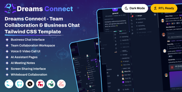
Dreams Connect is a modern, responsive social networking dashboard template built with tailwind and designed to create engaging online communities. It includes beautifully crafted pages, feeds, messaging, groups, events, notifications, and community management. Dreams Connect helps you build scalable social networking, community, and collaboration platforms with ease.
– Build with vuejs 3.5.40
– Build with Vue + Vite Config
– Create vuejs App Supported
– Hooks based architecture
– Pure Components Based vuejs
– Fully Responsive Design
– Multiple Layouts
– User friendly design
– Compatible Browsers: Firefox, Safari, Opera, Edge, Chrome
– Json format used
– Easy to Customize with css Variables
Project Overview
The project follows a modular structure with clear separation of concerns.
vue/
├── public/
│   ├── assets/
│   └── favicon.png
├── src/
│   ├── app/
│   ├── assets/
│   │	├── css
│   │   ├── icons
│   │   └── img
│   ├── components
│   ├── router
│   ├── views
│   ├── main.ts
│   └── App.vue
│
├── .gitignore
├── index.html
├── jsconfig.json
├── package.json
├── package-lock.json
├── postcss.config.js
├── README.md
├── tailwind.config.js
└── vite.config.js
Structure Overview
Dreams Connect Vue uses Vue Router, lazy-loaded pages, and shared layouts to keep the app scalable and maintainable.
The app entry in src/main.ts wraps routes with createApp and router, then mounts layout sync helpers.
Below is sample Vue app structure:
import { createApp } from 'vue'
import App from './App.vue'
import router from './router';
import Antd from "ant-design-vue";
import VueApexCharts from "vue3-apexcharts";
import Vue3Select from 'vue3-select-component'
import VueECharts from "vue-echarts";
import { use } from "echarts/core";
import { CanvasRenderer } from "echarts/renderers";
import { GaugeChart } from "echarts/charts";
import {
  TooltipComponent,
  TitleComponent,
} from "echarts/components";


import 'preline'
import '@fortawesome/fontawesome-free/css/fontawesome.min.css';
import '@fortawesome/fontawesome-free/css/all.min.css';
import '@/assets/icons/lucide/lucide.css'
import '@/assets/icons/iconoir/css/iconoir.css'
import '@/assets/icons/phosphor-icons/duotone/style.css'
import '@/assets/icons/phosphor-icons/regular/style.css'
import '@/assets/icons/phosphor-icons/fill/style.css'
import '@/assets/icons/icons-webfont/tabler-icons.css'
import '@/assets/css/style.css'
import '@/assets/css/vue.css'


const app = createApp(App)

use([
  CanvasRenderer,
  GaugeChart,
  TooltipComponent,
  TitleComponent,
]);
app.component('vue3-select', Vue3Select);
app.component("v-chart", VueECharts);
app.use(VueApexCharts);
app.use(Antd)
app.use(router).mount('#app');
Prerequisites
Node.js and NPM :
Ensure that Node.js is installed and running on your system.
https://nodejs.org/en/download/
Package Manager
Use npm (recommended with this project lockfile) or Yarn if preferred.
npm -vVite
Vite is used as the build tool. It is installed automatically as a project dependency — no global installation required.
https://vite.dev/
Installation Steps
Extract & Navigate
After downloading, extract the Dreams Connect package and navigate to the vue directory.
Install Dependencies
npm installBefore proceding you'll need to install npm packages. You can do this by running npm install from the root of your project to install all the necessary dependencies.
Start Development Server
npm run devFor running a project,run the command
Open in Browser
Open your browser at the URL shown in the terminal (typically http://localhost:3000/)
This project uses **Tailwind CSS v4.1.13** with extensive customization Tailwind is configured to scan the following paths for class usage:
```javascript
content: [
"./src/**/*.{js,jsx,ts,tsx}",
"node_modules/flowbite-vue/**/*.{js,jsx,ts,tsx}",
"node_modules/flowbite/**/*.js"
]Plugins:
The following Tailwind plugins are integrated:
- **@tailwindcss/forms** - Better default styles for form elements
- **@tailwindcss/typography** - Beautiful typographic defaults
- **flowbite/plugin** - Flowbite component styles and utilitiesYou can easily update the logo in two ways:
Option 1: Overwrite Logo Image Files (Recommended)
Directly replace the default SVG logo files in the src/assets/img/ directory with your own logos using the same file names:
logo.svg: Main logo (shown in light mode).logo-small.svg: Small square logo (shown when sidebar is collapsed/minimized).logo-white.svg: White text logo (shown in dark mode).
Option 2: Update VUE Templates
Sidebar Logo Structure (layouts-sidebar.vue):
<router-link :to="all_routes.hrmDashboard" class="logo logo-normal">
    <img src="@/assets/img/logo.svg" alt="Logo">
</router-link>
<router-link :to="all_routes.hrmDashboard" class="logo-small">
    <img src="@/assets/img/logo-small.svg" alt="Logo">
</router-link>
<router-link :to="all_routes.hrmDashboard" class="dark-logo">
    <img src="@/assets/img/logo-white.svg" alt="Logo">
</router-link>The default typography font for the template is Geist. If you want to change it to another Google font (like Inter or Roboto):
Open the style file src/assets/css/style.css and update the @import statement at the top of the file as well as the primary font variable in the @theme configuration block:
/* 1. Import the new Google Font at the very top of style.css */
@import url('https://fonts.googleapis.com/css2?family=Inter:wght@100..900&display=swap');

/* 2. Update the variable inside the @theme block */
@theme {
    --font-family-primary: "Inter", sans-serif;
}All theme colors are defined as design tokens under the @theme directive in your src/assets/css/style.css file. These variables control the look and feel of components:
@theme {
    --color-primary: #0F766E;   /* primary color */
    --color-secondary: #2563EB; /* secondary color */
    --color-success: #059669;   /* success states */
    --color-warning: #D97706;   /*  warnings */
    --color-danger: #B91C1C;    /*  error states */
}
Changing Element Colors
You can customize the color of any element by editing its class or variable assignment in the CSS file. For example, changing the header topbar background color:
.navbar-header {
    @apply bg-(--topbar-bg);
}How it Works
Dark mode state is managed in Redux and persisted to localStorage. A sync component writes the current theme to a data-theme attribute on the <html> element, which a Tailwind custom variant reads to apply dark: utility classes.
src/redux/themeSlice.ts holds a darkMode boolean, initialized from localStorage and toggled via toggleTheme() / setTheme(bool):
const initialState = {
  darkMode: getStoredString("theme") === "dark",
};
// toggleTheme() / setTheme(bool) update state and localStorage
src/layout/DocumentStateSync.vue is the single bridge that writes the attribute to the DOM whenever the Redux state changes:
document.documentElement.setAttribute("data-theme", darkMode ? "dark" : "light");In src/style/css/style.css, a custom Tailwind variant reacts to that attribute so any dark: utility applies automatically:
@custom-variant dark (&:where([data-theme="dark"], [data-theme="dark"] *));

/* usage example */
body { @apply dark:bg-none dark:bg-[#1A1A1A]; }To enable Right-to-Left (RTL) layout, add the dir="rtl" attribute to the <html> tag:
<html lang="ar" dir="rtl">Tailwind CSS automatically transforms positioning utilities (like margins, padding, and flex alignments) using standard logical properties when the dir="rtl" attribute is active.
RTL Demo
A preconfigured RTL demo is available. You can view layout-rtl.vue in your browser or source files to see a live demonstration.
Dreams Connect includes multiple popular icon packages ready for use. You can use any of the following icon libraries:
1. Lucide Icons
Use Lucide icons with the icon-[name] class prefix:
<i class="icon-house"></i>
<i class="icon-users"></i>
<i class="icon-settings"></i>
2. Phosphor Icons
Use Phosphor icons with the ph-[style] ph-[name] prefix classes (e.g. bold, duotone, regular):
<i class="ph-duotone ph-plus-circle"></i>
<i class="ph-bold ph-calendar"></i>
3. Font Awesome Icons
Use Font Awesome icons with standard classes:
<i class="fa-solid fa-hashtag"></i>
<i class="fa-brands fa-html5"></i>
4. Tabler Icons
Use Tabler icons with the ti ti-[name] class prefix:
<i class="ti ti-menu-2"></i>Dreams Connect is developed by Dreams Technologies and is available under both Envato Extended & Regular License options.
Regular License
Usage by either yourself or a single client is permitted for a single end product, provided that end users are not subject to any charges.
Extended License
For use by you or one client in a single end product for which end users may be charged.
What are the main differences between the Regular License and the Extended License?
If you operate as a freelancer or agency, you have the option to acquire the Extended License, which permits you to utilize the item across multiple projects on behalf of your clients.
| NAME | URL |
|---|---|
| Bootstrap | https://getbootstrap.com/docs/ |
| Bootstrap-vue-3 | https://www.npmjs.com/package/bootstrap-vue-3 |
| Fontawesome | https://www.npmjs.com/package/@fortawesome/fontawesome-free/ |
| Fullcalendar | https://www.npmjs.com/package/fullcalendar |
| Vue3-apexcharts | https://www.npmjs.com/package/vue3-apexcharts |
| Vue3-perfect-scrollbar | https://www.npmjs.com/package/vue3-perfect-scrollbar |
| Vue Date | https://www.npmjs.com/package/vue3-datepicker |
| Vue3-select2-component | https://www.npmjs.com/package/vue3-select2-component |
| TinyMCE Editior | https://www.tiny.cloud/solutions/wysiwyg-vue-rich-text-editor |
If you have any questions or run into issues with the template, feel free to contact us via email at support@dreamstechnologies.com.
Response Time: Typically 12–24 hours on weekdays (GMT+5:30). Support covers template bugs, errors, and standard features. It does not cover custom installations or custom coding changes.
Contact SupportDo you need custom development for your application?
If you need customization, new page integration, feature setups, or database connections, our engineering team can help tailor this template to your precise specifications.
- Tailoring features to your exact branding and workflow.
- Deploying the template to your production servers.
- Integrating backend endpoints and databases.

Thank You
Thank you for choosing **Dreams Connect**! We hope this template facilitates building your application. We kindly ask you to share your feedback by leaving a rating on ThemeForest.
Leave a Review